
MATR
Not just hydration — a brand for the ones who strive for more.
MATR is a zero-sugar, functional hydration drink built on a simple idea: everyone matters. Not just the elite athlete, but the tired mum, the early riser, the over-caffeinated, the hustler, the resetter. Founder Steven built the brand from his own run club and briefed Cove to make it feel bold, dynamic, and unmistakably its own - not just another hydration drink. We built the identity from the ground up: strategy, visual system, packaging, and campaign, for a brand about people as much as electrolytes.
Client:
Steven Komene & Aaron Boccardo
Year:
2026
Industry:
Health & Wellness / Beverage (ready-to-drink hydration)
Brand Strategy
Creative Direction
Visual Identity


THE CHALLENGE
Energy and hydration drinks live and die by shelf stand-out, which usually means neon colour, maximalist graphics, and volume. MATR needed the opposite: something bold and dynamic enough to be unmistakably its own, without shouting to get there.
The brief was simple to say and hard to do - make MATR feel engineered, not decorated. Distinctive enough to be recognised at a glance, restrained enough to never chase a trend.
Category sameness
Loud, neon competitor packaging
Non-inclusive sports tone
Risk of feeling decorative, not engineered


OUR APPROACH
DISCOVERY
Start with what "MATR" actually means.
We dug into the name itself: scientifically, matter is the physical substance of atoms, molecules and cells — echoing the electrolytes, sodium, and magnesium at the core of hydration. Dark matter, unseen but essential, became the guiding metaphor for what MATR does beneath the surface: energy, recovery, and focus you feel but don't see.
STRATEGY
Everyone matters — not just the elite athlete.
We positioned MATR around an inclusive, lifestyle-first idea: health, family, work, any person, any age — everyone matters, and MATR exists to support anyone chasing what matters to them. It's a platform built for the tired mum and the early riser as much as the serious runner.
DESIGN
Two marks, one idea: unseen but essential.
That thinking shaped two marks — a clean, bold sans serif wordmark with a subtle "+" nodding to the molecular makeup of electrolytes, and a secondary molecule-cluster icon built from negative space shaped into an "M," slanted for movement and echoing dark matter's unseen presence.
DELIVERY
A system built to stand out by staying quiet.
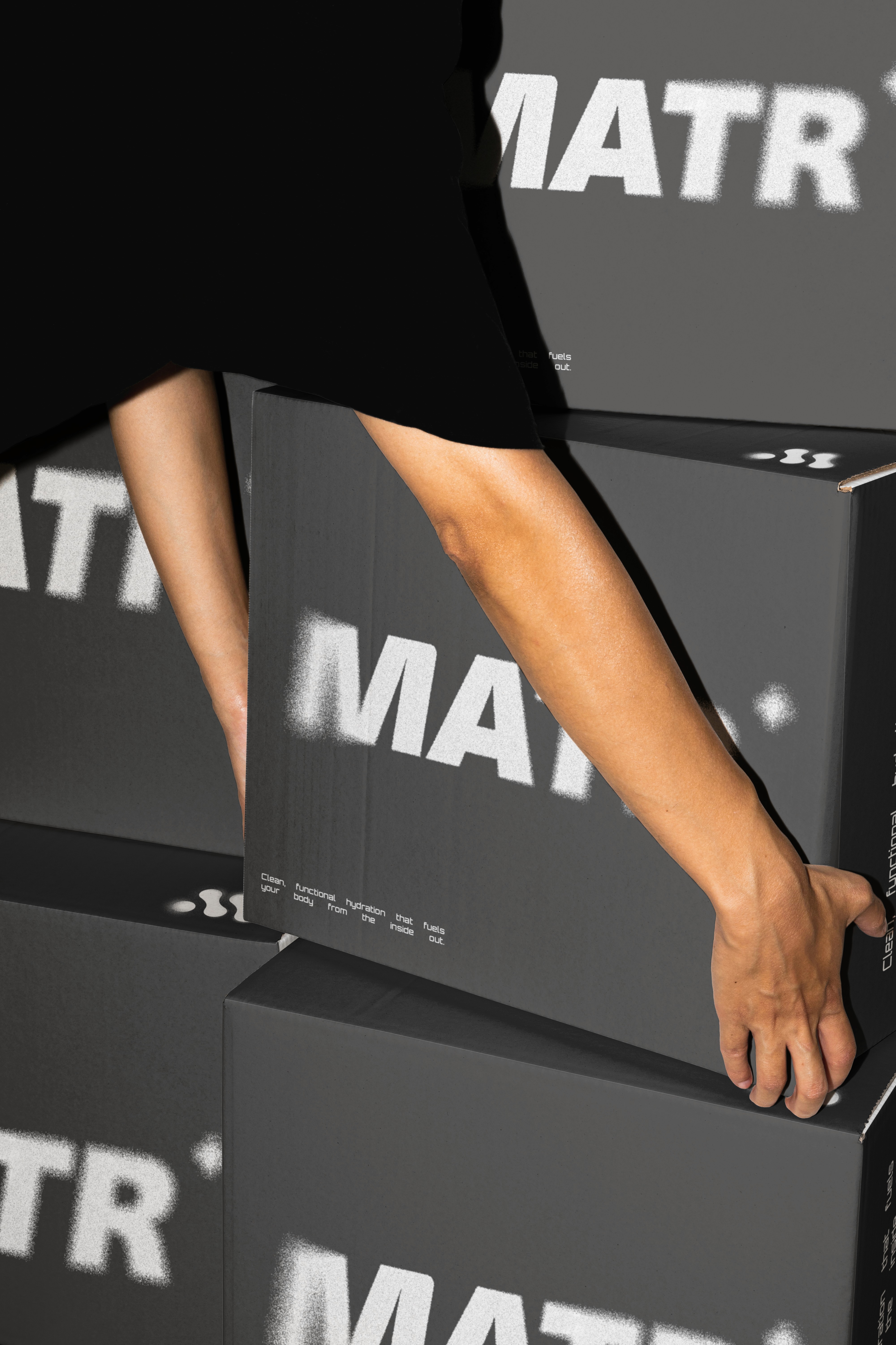
MATR walked away with a full identity system — wordmark, icon, a refined palette of off-black, off-white, pure black and reflective silver chrome, plus packaging, social, and out-of-home assets — extended into a teaser billboard campaign built entirely on silhouette and restraint.


The plainest can on the shelf, on purpose.
Surrounded by neon colour and maximalist graphics across the energy drink category, MATR's plain brushed-silver can is the one that doesn't shout - and stands out for it. A spray-texture treatment across the logo, cans, and packaging references molecular clusters and dark matter in motion, giving the restrained system an unconventional edge.

OTHER PROJECTS
View All Projects

Ready to build something bold?
Let's create a brand that moves your business forward:
Work With Me
View More Work
